
Although I was very happy with my previous design I was still playing around with colours and effects and inspired from my initial design i decided to give the "!" more definition. And despite this only being an experiment as such it infact works very well and just adds to the design.

Extending on the space theme from my previous adjustments I am now using the paint brush tool, adding small squares around the text giving it a star like feel. This has revoultionised my design and has brought it to life. I am very pleased and feel like this gives my logo the edge it needed and makes it different and unique.

I have made a slight adjustment to the previous design by adding a light glow from the bottom of the text. Though it is a simple and slight differnence I feel it adds real impact to the logo and makes it stand out that bit more and also gives it a space like feel rather that a club feel like a neon sign.

This is my second design, where I have now changed the font to "cherry light". The font works much better with the glow and I have also changed the colour to purple to make it more feminine. The design has a very party/club feel to it and I like this, however iIstill feel there is something missing from it which gives in that extra edge to it.

This is my first initial idea. I used an urban feeling font to try and keep it modern and hightlighted the exclamition mark with a neon glow to make it stand out. After creating this i do not feel as if the font works well with the colours or effects and have decided it is not suitable for my magazine. It is very masculine and would not appeal to my target market. However there are elements of this design I do really like. I think the colours work very well togther and i like the neon glow.
Now that I begun developing my logo I am playing around with fonts an effects on photoshop in order to create and imaginative, powerful brand for my magazine.

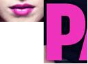
 This layout is much more feminine and I feel like this would appeal to a bigger range of people. The logo it clear but does not over power the image which is very important to bear in mind.


 This is intense gaze is engaging and enticing and draws readers in. Her body language shows she is fiesty and has attitude. It also a stereo-typical pose that is associated with teenagers/ youngpeople which makes the band appeal to this young market. Her hair and lips are a striking contrast to the rest of cover which draws our attention to the centre of the page. She has green chipped nail varnish showing she is unique and different, giving her a punky look and a sense of carefree attitude.


