
- Produced by IPC
- Costs £2.30
- Published weekly every Wednesday
- Target market men aged 17-30
- Circulation 40,948 (ABC Jan-Jun 09)
- Readership 388,000(NRS Jul 08-Jun 09)
- 69% of readers are males
- 31% of readers are women
- The average age that reads NME is 24 years of age
- Was launched in 1952 and is a British Magazine
- NME stands for news musical express
- Music tabloid magazine

Title, masterheads/logos, typefaces and graphics
- Clear use of layers that have been used to put lead singers; Hayley Williams's head over the NME logo. Although this covers the logo NME is such a well known brand it is not essential for us to see all the logo to know what magazine it is.
- There is a clear use of house fonts and colours creating the cliche construction of an NME layout.
- A theme of primary colours are used for the captions and sub titles- red white and black which appeal to the magazines target audience of males. Red white and black are simple yet effective colours which still stand out but to not detract from the main subject of the cover.
- Simple bold fonts are used to emphasise them yet do not distract us from the main image.
- Three different fonts are used to break up information and make it easier on the eyes
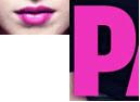
- The bands name is in pink which is taken from the colour in the girls Hayley Williams lips
- This adds continuity to the magazine and establishes the idea that the image and title are linked making it instantly clear who the main feature of the magazine will be. Although the words "paramore" are in pink it is appropriate as the word paramore means lover and pink is automatically linked with the idea of love. Also it is a very deep pink so while being different to attract attention it does not demaculinate the picture.
Main image
- The men in the background also maintain the edginess and masculinity of the magazine
The image of Paramore is a reflection of their music which is slightly dark, edgy and quirky. This is shown in their clothing which are dark which adds mystery but also sophistication, yet are dressed fairly modestly showing their laid back attitude.This picture shows what the band is all about and reaches out to readers who enjoy this type of music.
- The lead singer Hayley Williams has a very intense gaze looking face on into the camera.
 This is intense gaze is engaging and enticing and draws readers in. Her body language shows she is fiesty and has attitude. It also a stereo-typical pose that is associated with teenagers/ youngpeople which makes the band appeal to this young market. Her hair and lips are a striking contrast to the rest of cover which draws our attention to the centre of the page. She has green chipped nail varnish showing she is unique and different, giving her a punky look and a sense of carefree attitude.
Content and Language
- "685 UK gigs listed"- gives the reader the idea of varitey and also that they are getting alot for their money.
- "everyone else has fallen for them will you?" This is a direct question adressed to the reader making the tone of the magazine friend-like and also personal to each individual.
- "Guns, gods and 4 million albulms sold"- This alliteration is a common technquie used in magazines to engage readers it breaks down the information created a relexed and fun tone to the magazine
- Persuasive language is used through the magazine using rhetrical questions such as "will you" which engages and adds intrest. The magazine also makes big bold statements such as "USA love us" which are also emotive and engaging.
- The magazine "tells" us what we want and tells us this is a good quality magazine this is highlights through the use of the bold definate statements and bold wording which can not be argued with.
All NME issues follow a similar layout to this magazine making it instantly reconginsable to its readers as do other music magazines such as Kerrang and Q magazine. However NME is made distinctive through its use of logo, signiture fonts and the use of bold and striking photography used to engage with the readers. The size of NME could be considered as its unquie seeling point as it is 300mm x 240 mm this gives the magazine more of a sqare shape where as opther magazines are taller and thinner. This makes NME stand out from the crowd because it is unusal and differnt making it instantly distinctive from other magazines.
Reflecting.
From this analysis of an issue of NME magazine I have learnt the techiques and stratagies magazine editiors use to engage thier readers and make their magazines disitnctive and unique. In order to make my magazine successful I will need to use similar techquies such as effective and persuasive language, striking engaging images, puns, allieteration, bold powerful statements, the rule of three and all the other various things that NME editors have used to attract their audiences.
No comments:
Post a Comment